Brand
Hearthstone, Blizzard Entertainment
Focus
Game Logo Design, Brand Identity,
Art Direction
Tools
Photoshop, Illustrator


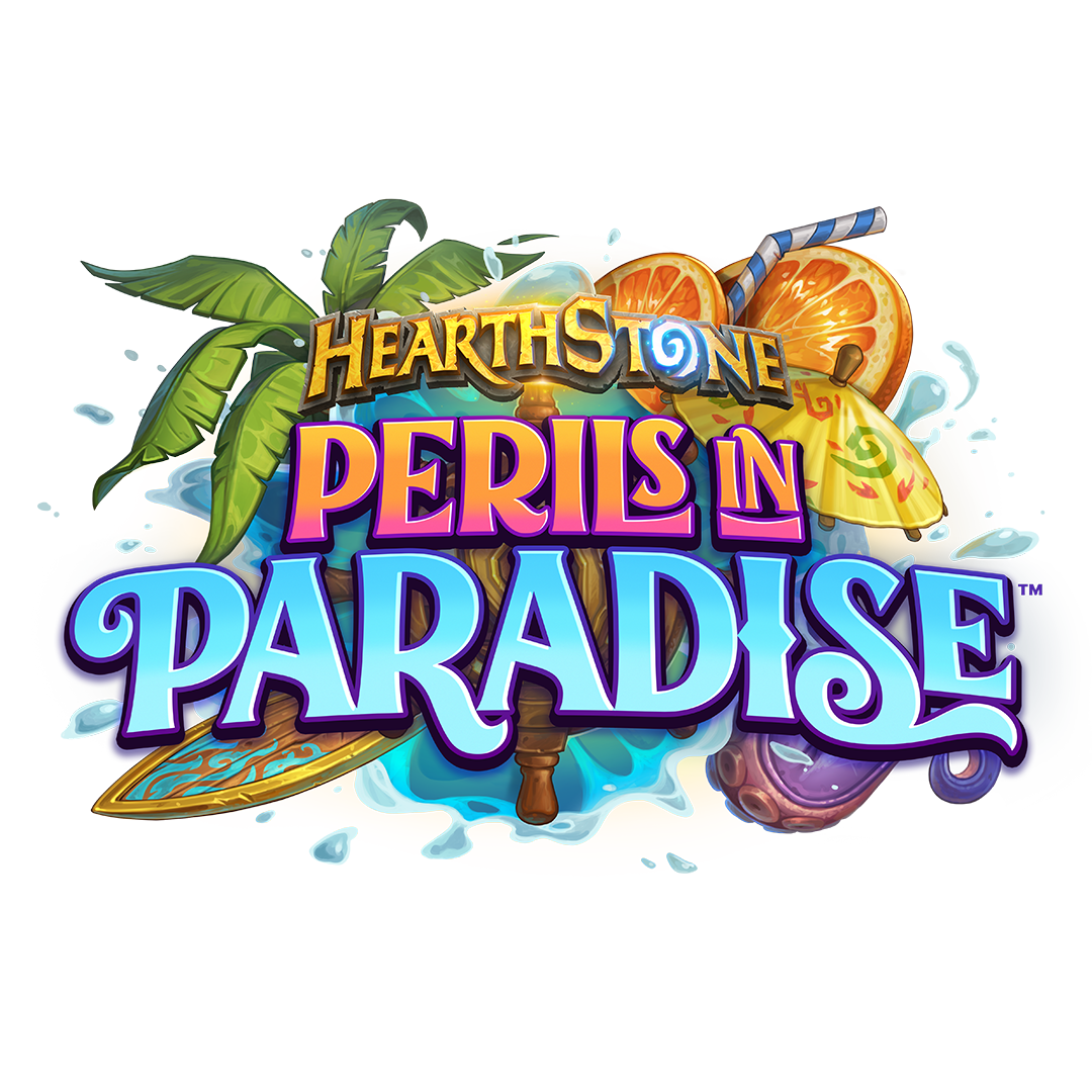
Perils in Paradise was Hearthstone’s mid-year expansion for the Year of the Pegasus, in 2024.
The type design features relaxed, beach-inspired forms with subtle tropical gradients. Set in a deceptively idyllic resort, the expansion’s lore brings classic Hearthstone whimsical magic to a perilous island. The logo plays into this duality.
©Blizzard Entertainment
Typography
During the type exploration, I worked closely with the Hearthstone Dev Team in developing the backplate. The type treatment provides a playful resort vibe—bright, breezy letterforms displaying tones of tropical adventure. It strikes a balance between vacation charm and lurking danger, capturing the expansion’s tone of deceptive paradise.


Type Treatment
The type colors for the Perils in Paradise logo were designed to complement the vibrant, tropical backplate while maintaining clear visual hierarchy. Warm sunset tones were used to evoke a beach like, sunlit feel, contrasting with the cooler ocean blues, and splashy elements of the backplate.


Type paint-over-texture
provided by Hearthstone Dev Team
Credit: Tiffany Chiu
Localization Support
Localization support for the Perils in Paradise logo focused on preserving the playful tone across all languages. Each localized version retained the core color palette and tropical styling of the original type, ensuring consistency in mood and visual impact across all character sets.